Applications of design in my experiments and work.
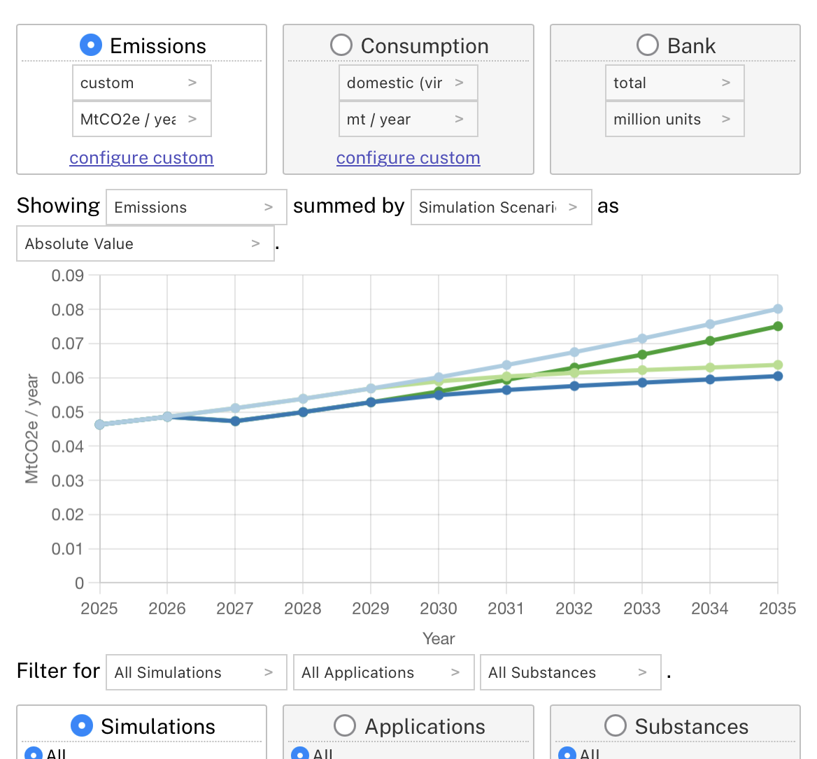
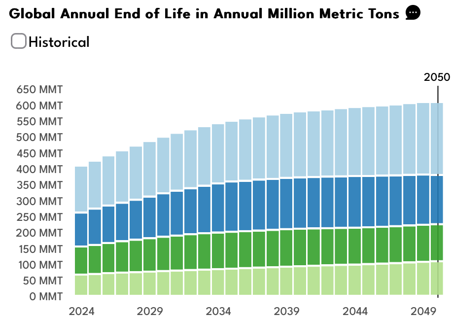
AI Plastics Tool
Interactive simulation of global plastics policies.
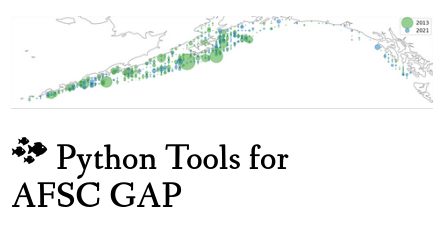
AFSC GAP
Open source Python-based tools for analyzing the NOAA AFSC GAP dataset.
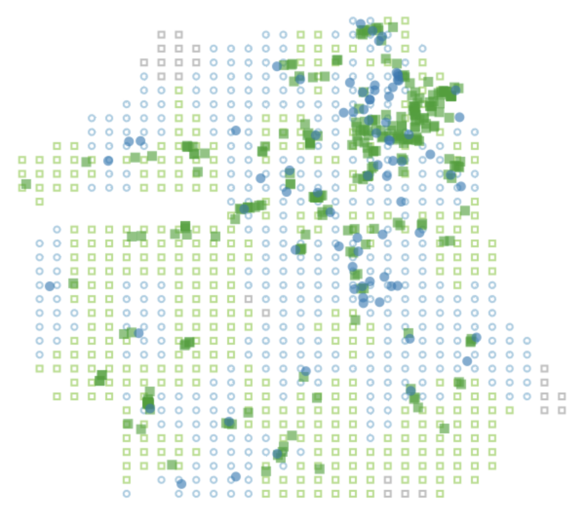
SF Food Sim
Simulation of food access in San Francisco exploring data viz + data sci + game design.

Thinking through Viz Tools
How visualization tools embody different data viz philosophies and how those influence our work.
Data Science for System Design
Talk given to university systems design courses.
When Accuracy Isn't Enough
Visualization and game design for data science and machine learning.
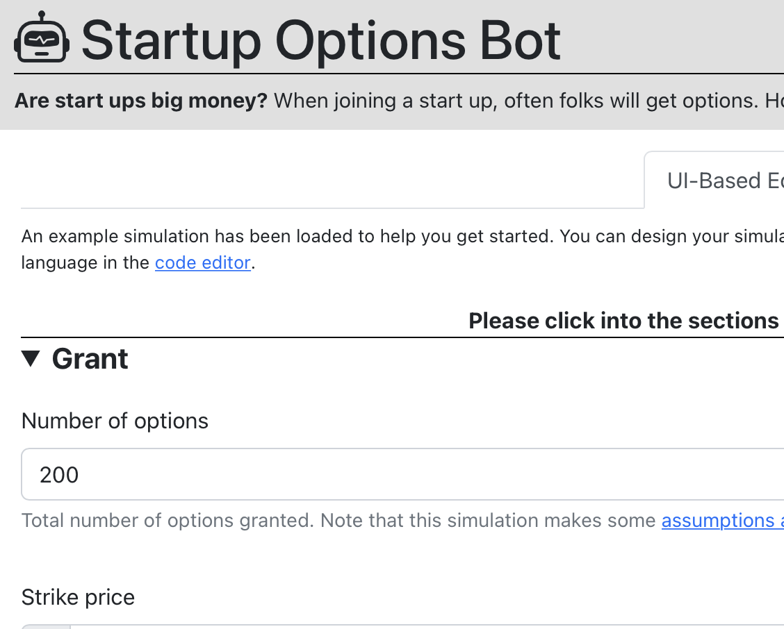
Startup Options Bot
Domains specific language and GUI for simulating options outcomes.

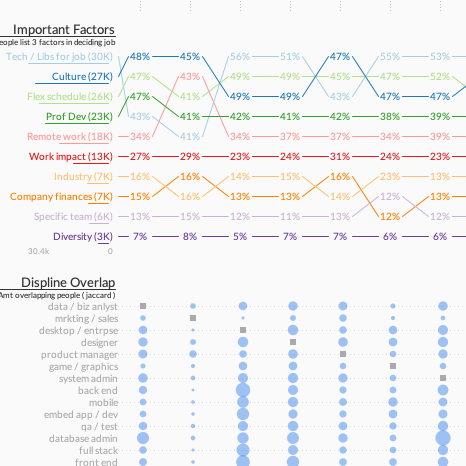
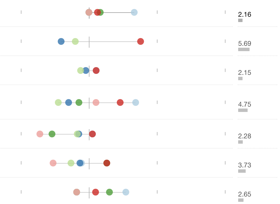
Satisfaction in Tech
What are the happiest jobs in tech? A data science-based investigation.
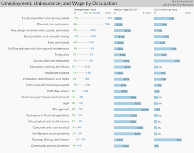
COVID Unemployment
Inequality and the Occupations with the Deepest Unemployment
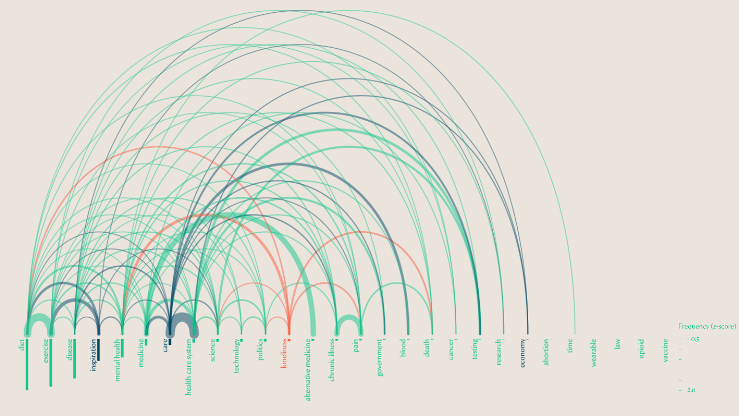
Everyday Health NLP
Natural language processing on social media to understand everday health during COVID.
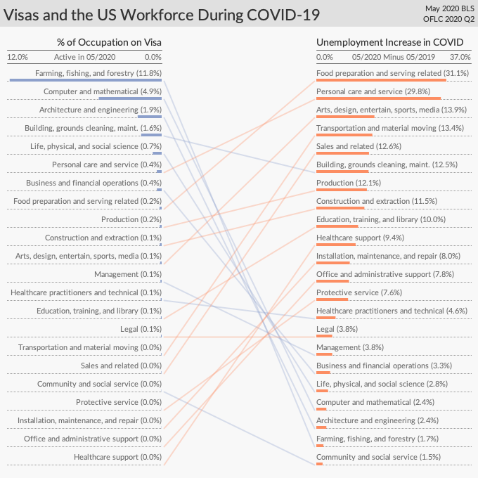
Work Visa Analysis
Why cutting work visas will not solve COVID unemployment
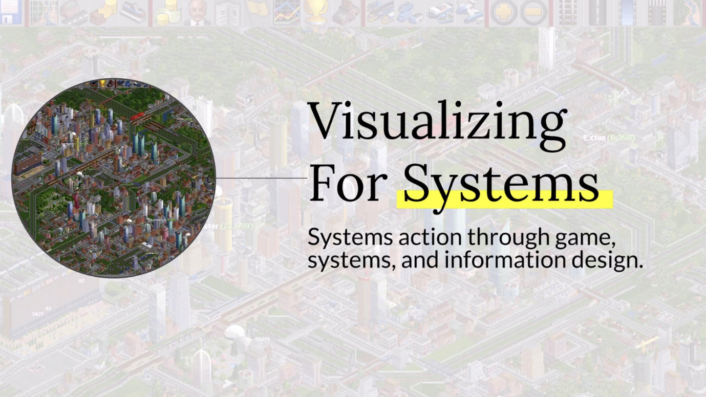
Visualizing for Systems
Talk given to a university systems design course.
CU Course Timeline
Timeline of CU Boulder course catalog / schedule.
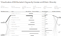
US Bachelors Degrees by Gender and Ethnicity
Visualization of US bachelor's degrees by gender and ethnic diversity. Browser-based written in d3.js.
SF Airbnb Analysis
How does Airbnb impact housing in San Francisco? Analysis and data.
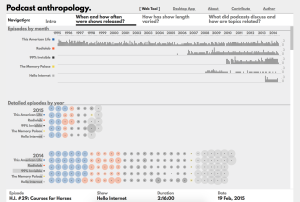
Podcast Anthropology
Visualization of podcast history and topics. Browser-based written in p5js.
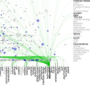
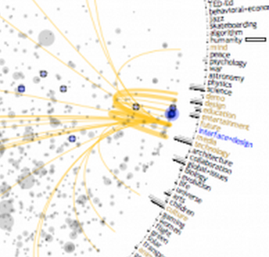
TED Visualization
Visualization of how ideas are interconnected as demonstrated by the TED conference. Browser-based written in d3.js.
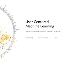
User Centered Machine Learning
Modeling and visualization techniques for addressing bias in machine learning, taking steps towards more inclusive data science.
Ant-inspired Resource Gathering Simulation
HTML5 canvas / JavaScript model of ant behavior as a self-optimizing resource gathering network.
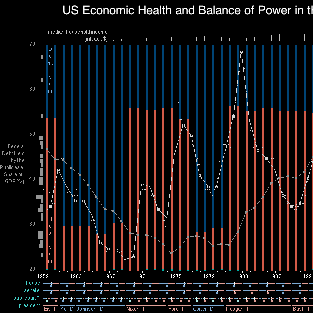
Economic Health and Political Balance
Visualization of US economic health and balance of power from 1959 to 2011. Static image.
Analyze Boulder Census
Interactive visualization of the Analyze Boulder Census. In-browser / web-based application.
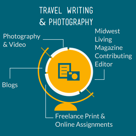
Kit Bernardi Infographics
Graphic design / infographics for an award-winning travel writer.
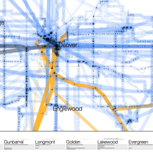
Colorado Income and Population through Public Transit
Where Colorado public transit goes, who uses it, access to mobility, distribution of population, and income levels throughout the state. d3.js web-based visualization.
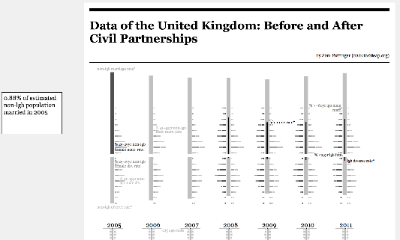
Data of the United Kingdom - Marriages and Civil Partnerships
Visualization and analysis of UK Marriage and Civil Partnership statistics. Browser-based (d3.js) with commentary. (prerelease)
TED Visualization (old)
Published visualization of the history of the TED conference. Desktop App.
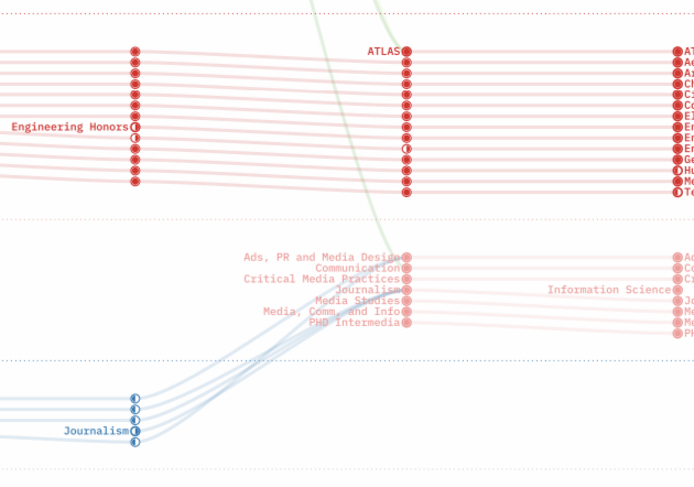
CU Language Project / Undergraduate Thesis
Cross-disciplinary undergraduate thesis on Techniques for Interactive Visual Exploration of Dynamic Linguistic Networks.
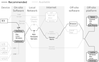
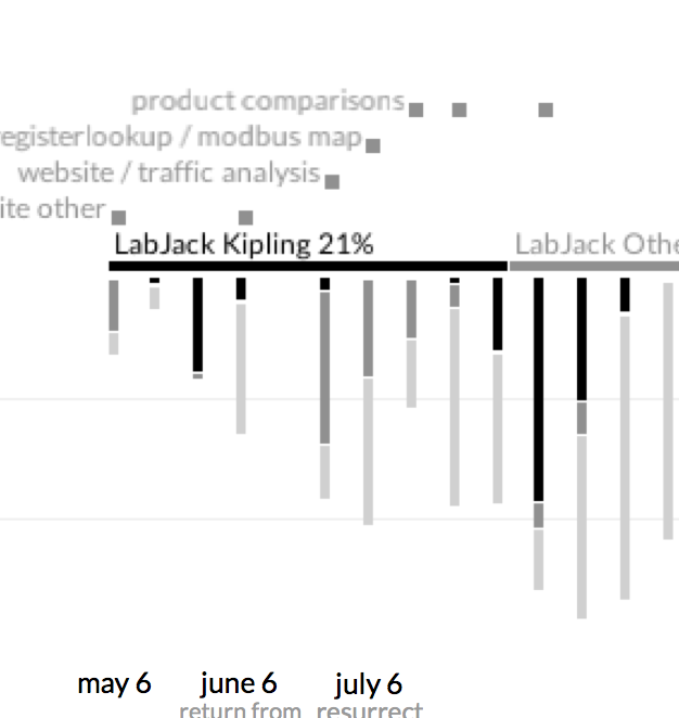
LabJack Use Cases Diagram
A succinct summary of all of the way to connect to and make LabJack devices available.
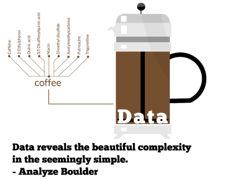
Analyze Boulder Flyer
Flyer made for Analyze Boulder, a Boulder, CO meetup for all things data and data science.
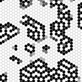
Hexagonal Population Game
HTML5 canvas / JavaScript hexagonal population variant on Conway's Game of Life.
FCQ Visualization
Visualization of the Faculty Course Questionnaire dataset from the University of Colorado at Boulder.
Contracting Hours Visualization
Visualizing almost a year of contracting.
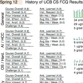
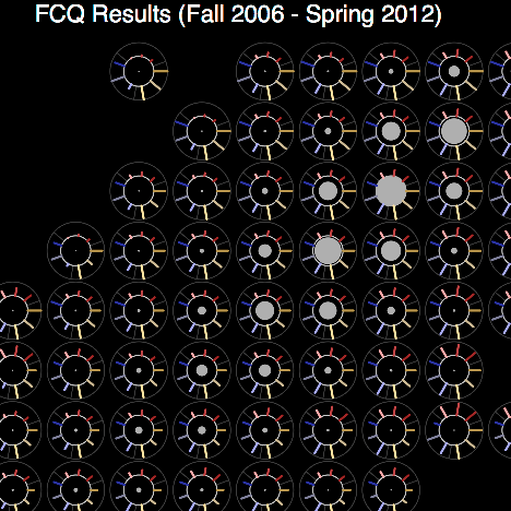
UCB CS FCQ History
Visualization of the history of FCQ results from the CS dept. at CU Boulder.